Web Components (33)
& Content Outlines

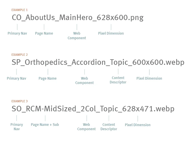
Web Components can be thought of as puzzle pieces that make up a webpage. Each component is built based on a responsive design and requires specific image sizing, character-counts and file labeling in order to easily update existing pages or build new.

Our DAM is where all corresponding web component images must be uploaded, these include; photos, logos, icons, product shots, and award badges. The DAM is also where all marketing collateral is uploaded. These assets sync directly to our web content management system, Sitecore–allowing our digital team to easily locate files and edit or build pages.

Home Hero - NEW

Used on homepage only, different from hero on inner pages
For Design Team

Old PSD File Name: Hero Pinwheel-Hero_934x700.webp

New PSD File Name: HomeHero_710x600

  • Can have a green or yellow square behind it. 
  • Imaged needs to be PNG. Used on Dark Background
  • Make sure to add border radius to round the edges
  • Notification is part of the image or seperate image that can be provided? 
  • Gif or Image Carousel
  • Full bleed on all sides except left
  • Used for: Landing pages that need a hero plus immediate supporting proof or explanation
  • Word limits (authors): Hero title 10 words max, hero body 40 words max. Two-Column eyebrow 6, headline 8, body 40

Dual Spotlight

Used on homepage only
For Design Team

New PSD File Name: Dual_spotlight_628x440.png

  • Almost exclusively used for the homepage or for the stack right below the hero.

Main Hero

Pinwheel Hero
For Design Team

New PSD File Name: MainHero_628x600.png

  • Small award is 60×60, can use existing logo size 
  • Can have a green or yellow square behind it. 
  • Imaged needs to be PNG. Might be used on dark or light backgrounds
  • Make sure to add border radius to round the edges
  • Word limits (authors): Title 10 words max, body 40 words max
  • Allow for animations
  • Allow for 60/40 and 50/50
  • Allow for background change
  • Allow Hero with Form on left or right

Closed Loop Stack

Used to showcase Closed Loop
For Design Team

New PSD File Name: None, will be code. 

  • 526×526 is the size
  • There is always 5 pieces
  • They are always the same
  • Words cannot change on the right
  • Lite background version only
  • Word limits (authors): Title 2 to 3 words, label 3 words, body 40 words
  • Titles must always fit in one line, description less than 3-4 lines. 

2 Column

completed 100%
For Design Team

New PSD File Name: 2Column_628x471.webp

Note: Background is part of the image

Content Carousel

There are no design changes to the images

New PSD File Name: Content_carousel_412x232.webp

Related blog navigation
Closest 2023 component: Related Content Carousel
Used for: Show related posts or resources
Word limits (authors): Title 6 words, asset title 8, label 8, CTA 15, max 6 assets
Image specs (design): Asset-Image_350x181
Dev notes: Confirm it can pull blog posts and resources, and allow manual override.

Related resources
Closest 2023 component: Related Content Carousel
Used for: Resource highlights
Word limits (authors): Same as above
Image specs (design): Asset-Image_350x181
Dev notes: Use for 3 to 7 highlight sets per note, but component spec says 6 max, decide and standardize.

Icon Grid - NEW

aka Benefits Grid, COLUMNS version will not replace existing stacks

New PSD File Name: None

Font Awesome Icons will be used in green and dark background.
Image specs: Icon_box is 64×64 and Icon is (21×21)

Tabbed Highlights

aka Product Highlights
For Design Team

New PSD File Name: TabbedInset_480x400.png (with notification)

New PSD File Name: Tabbed_highlights_440x400.webp (without notification)

  • Notification can be added directly into image. 
  • Or can be added with code manually.

Word limits (authors): Eyebrow 6, headline 8

Another tabbed component will exist that you can add anything other component to be the body of the tab.

Logo Carousel

aka Awards Carousel

Award New PSD File Name: logo_300x300.png (square)

Client New PSD File Name: logo_240x140.png (landscape)

Closest 2023 component: Awards Carousel
Used for: Awards, client logos, recognition
Word limits (authors): Eyebrow 6 words, body 30 words
Image specs (design): Logos spec varies by carousel
Dev notes: Ensure logo count behavior, spacing, and alt text rules.

Quote Carousel

aka Block Quote

Word limits (authors): Block Quote 35 words max, or Content Block 360 words max. If headshot then used square 300×300

New PSD File Name: Fname_lname_headshot_300x300.png

Text Block Paragraph - NEW

Used for the About Page

New PSD File Name: text_block_bg_1408x604.webp

Video Stack - NEW

Used to be the stack above testimonials, will not replace existing stacks

New PSD File Name: VideoCover_844x475.jpg

Thumbnail should be consistent with the standard video size of 4:3 or 16:9​. What is set in wistia for the video will be used in most cases.

Data Numbers Grid - NEW

Columns version will not replace existing.

Used for: Metrics and proof stats

Word limits (authors): Eyebrow 6, headline 12, value is numeral with $ or %

Dev notes: Ensure number formatting rules and footnote support for claims.

CTA Stack

Coming Soon

Closest 2023 component: CTA Block
Used for: Final conversion section
Word limits (authors): Eyebrow 6 words, headline 6 words
Image specs (design): N/A
Dev notes: Add Lite style option to CTA Block rather than separate component.
Usually the last section of every page

Accordion

AKA Highlighted Benefits - Defaults to no image and center aligned
For Design Team

PSD Template Name: Accordion_600x600

Calculator

completed 100%

Comparison Table

Not Started Yet
not started 0%

Coming Soon

Word limits (authors): Eyebrow 8, headline 40, column labels 2 to 3 words. Dev notes: Enforce short column labels. Add checkbox support and accessibility validation.

PHASE 2 - STACKS

Three Card Alt

Used on homepage only to reduce stacks
Not Started Yet
not started 0%
For Design Team

New PSD File Name: Three_card_alt_412x520

  • Alternating Dark lite Dark
  • Treat as background image
  • Sometimes it fills the card (when dark) and sometimes it just shows the top 2/3 (on lite)
  • Word limits (authors): Eyebrow 6, headline 8, body 40

3 Card Solution

Used on homepage only to show other solutions
Not Started Yet
not started 0%
For Design Team

New PSD File Name: 3CardSol_412x309.png

  • Just the graphic on artboard
  • Background will be added with css.
  • Word limits (authors): Eyebrow 6, headline 8, card title 5, card body 35
  • Used for: Feature cards with icons plus proof point
  • Body copy max 2 lines, and Title less than 2 lines.

2 Card Solution

Used to show other solutions of NGE and NGO
Not Started Yet
not started 0%
For Design Team

PSD Template Name: 2CardSol_628x400.webp

  • Always Dark
  • Treat as background image

RSVP Event Stack

Not Started Yet
not started 0%

RSVP and What to Expect for event pages

2 Column List

Used for Specialty pages
Not Started Yet
not started 0%

Word limits (authors): Title 2 to 3 words, label 3 words, body 40 words

External Quote Carousel

HTML stack and updated Reviews stack

For us to update the design of existing quotes to look like the tan and green stars and rounded edges. 

Not Started Yet
not started 0%

Coming Soon

Multi Row Content

Used for event or webinar landing pages
Not Started Yet
not started 0%

Pricing Table

Not Started Yet
not started 0%

Form

Not Started Yet
not started 0%

CTA Grid

Not Started Yet
not started 0%

Coming Soon

Closest 2023 component: Landing Page Form + supporting stacks
Used for: Contact modules
Word limits (authors): Form hero word limits apply when used
Image specs (design): Pinwheel-Hero_934x700 if hero form
Dev notes: Make a Contact template using existing components, avoid a one-off custom stack.

People Grid

Remove border and round edges and update font for Leadership
Not Started Yet
not started 0%

Events and Webinars and Leadership

For Design Team

New PSD Template Filename – LeaderHero_1080x1080

LeaderThumb_330x330

Mega Menu

in progress 90%

New PSD File Name: Mega_menu_card_bg_300x300.webp

Gradient will be added with code. 

Case Study - Text Block

NOT FINAL, feedback needs to be implemented
Not Started Yet
not started 0%

Case Study - Block Quote

NOT FINAL, feedback needs to be implemented
Not Started Yet
not started 0%

Case Study - Image Block

NOT FINAL, feedback needs to be implemented
Not Started Yet
not started 0%

Resources Page Styling Updated

NOT FINAL, feedback needs to be implemented
Not Started Yet
not started 0%

SocialHero Image

Every page has 1 image that is shown when shared on social or teams or linkedin.
Not Started Yet
not started 0%

New PSD File Name: SocialHero_1200x628.jpg